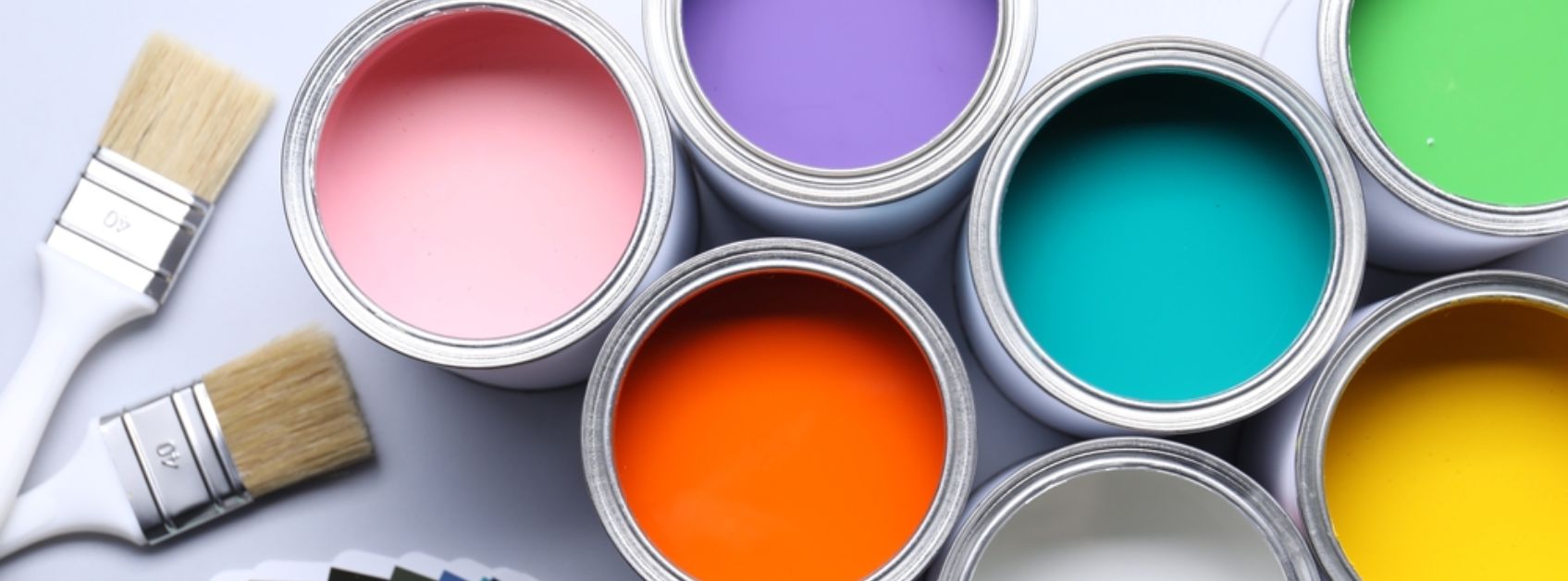
On a cloudy morning in Pittsburgh, a homeowner is thinking deeply in the living room, holding three paint swatches. In the store they looked warm and appealing, but here, under soft natural light and brick reflections from outside, they suddenly feel totally different. One looks gray, one looks yellow, and one changes every hour of the day. This is the reality of choosing paint colors in Pittsburgh. Because homes in Pittsburgh are not only under the influence of sunlight alone. Rather, there are various factors like overcast skies, mature trees, historic brick, and seasonal lighting shifts affecting the paint color. Moreover, it is also an interesting fact that a color that looks ideal and best online may look dull indoors, and a trendy shade may clash with architectural character. That’s why homeowners often search for a savvy painter in Pittsburgh, PA, before committing to gallons of paint they might regret.
Finding the best paint color is not about guessing or following trends. It’s about understanding all perspectives. perspectives. Perspectives like lighting direction, room type and structure, existing materials, and neighborhood style. Professional residential and commercial painter teams approach color selection like a system, evaluating how tones interact with flooring, trim, furniture, and exterior surroundings.
Paint is not only about covering walls. It favors comfort, enhances value, and makes a home feel naturally balanced according to the environment.
9 Steps to Find the Best Paint Colors for a Pittsburgh Home
There are many ways to find the best professional residential and commercial painter in Pittsburgh. We are going to elaborate one by one to make your choice easy to find the best way for your paint.
1. Understanding Pittsburgh’s Natural Light Before Picking Paint
Light is the most basic element in color selection, especially in Pittsburgh, where skies shift frequently between bright sun and soft overcast. Paint colors act uniquely as compared to sunnier climates. A beige may feel warm at noon but gets gray by evening, while a cool white might feel crisp one day and dull the next.
Professional painters never depend on showroom lighting. Rather , they evaluate how daylight intrudes your home and how long it stays. Homes guarded with trees receive filtered green light, while hillside homes receive shiny blue sky light. The ideal color is one that remains comfortable across all of these conditions, not just under perfect lighting.
2. How Home Orientation Affects Interior Color Choices
The direction your windows face directly changes color appearance.
The rooms aligned to the north are usually darker or shadier, so balanced warm neutrals prevent the space from feeling cold. While rooms facing south are vulnerable to consistent sunlight and benefit from softer neutrals that control brightness. Rooms facing the eastern side feel lively in the morning but get muted later, making gentle tones ideal. Rooms facing west glow in the evening and require colors that resist turning orange.
The best residential painter in Pittsburgh, PA, examines this before recommending any palette because orientation decides whether a color will feel inviting, appealing, or uncomfortable.
3. Matching Paint Colors With Brick, Trim, and Historic Details
There are homes that contain permanent materials that affect color: brick fireplaces, hardwood floors, stone foundations, or detailed trim. Paint should support these elements, not fight them.
Warm brick works best with earthy neutrals and warm whites. Dark trim pairs well with mid-tone walls. Historic architecture often needs layered tones rather than stark contrast. Ignoring these relationships is why many repaint projects happen shortly after completion.
A professional residential and commercial painter has an assessment about the undertones already present in the home before suggesting colors.
4. Choosing muted shade that stays consistent through all seasons
Two colors can seem identical on a chip but behave differently on the wall because of undertones. Pittsburgh’s seasonal lighting overexpresses these changes.
- Warm greiges bring serenity during cloudy months
- Balanced whites resist blue winter glare
- Muted blue-grays remain serene at sunset
- Soft greens stay natural against summer foliage
The main goal is durability. A good color should not feel dramatically different between January and July.
5. Picking the Right Paint Finish for Each Room
Color and finish work relatively well. Sheen affects both appearance and durability.
Flat finishes conceal imperfections, useful in older plaster walls. Eggshell softens reflections in living areas. Satin reflects cleanability for kitchens and hallways. Semi-gloss show trim and shield doors.
A professional painter in Pittsburgh, PA, chooses finishes based on traffic, lighting, and surface condition so the color looks smooth rather than reflective or uneven.
6. Strategize a Room-to-Room Color Flow That Feels Natural
Homes feel serene when colors transition slowly rather than abruptly. Instead of unrelated shades, professionals design a connected palette.
A main neutral anchors common spaces, hallways step slightly lighter, and bedrooms introduce gentle accent tones. This creates movement while maintaining harmony.
Consistent undertones are key. When every shade belongs to the same family, the home feels intentional instead of mismatched.
7. Testing Paint Samples the Right Way in Pittsburgh Lighting
Small swatches are not worth considering. Professionals examine large areas directly on the wall and observe them at multiple times of day.
Morning, afternoon, and evening lighting all affect perception. Artificial lighting must also be considered because warm bulbs and cool LEDs shift undertones differently.
A reliable residential and commercial painter will always make an assessment of paint in the actual space before full application to minimize expensive repainting.
8. Avoiding Common Color Mistakes Homeowners Make
Many color problems occur due to some basic wrong choices:
- Selecting colors online only
- Ignoring the materials in the building’s vicinity
- Using too many accent walls
- Selecting very cool grays in dark rooms
- Picking stark whites in overcast spaces
However, insightful planning prevents regret and extends the life of the paint decision.
9. Working With a Professional Painter Pittsburgh, PA, for durable Results
Selecting color is a technical and delicate process, not guesswork. Your whole building, lifestyle, and even your mood depend on these colors. So, choosing wisely can enhance your daily moods. On the other hand, selecting bad choices can also impact your mood. Professionals analyze lighting, architecture, finishes, and lifestyle before painting begins.
A trusted residential and commercial painter ensures the chosen palette works year-round, complements the property, and maintains value. The goal is not just fresh walls—it is a home that consistently feels balanced and comfortable.
FAQs
- Why do paint colors look different in Pittsburgh homes?
Because of consistent cloud cover and reflective brick surroundings in Pittsburgh, colors shift throughout the day and across seasons. - Should I test paint samples before painting the whole room?
Yes. Large wall samples assist you in seeing how lighting changes color in the morning, afternoon, and evening. - What colors work best in darker rooms?
Warm neutrals, soft whites, and balanced greiges prevent rooms from feeling cold or dull. - Do professional painters help choose colors?
A professional painter in Pittsburgh, PA, or a residential and commercial painter, evaluates lighting, materials, and layout before recommending a palette. - How many colors should a home interior have?
Most homes look best with 2–4 coordinated colors that flow naturally between rooms rather than many unrelated shades.